
Not a surprise saying that the amount of mobile users is growing from year to year. The number of customers who use mobile devices for shopping and browsing was close to 30% in 2018. In some industries, it has passed 50%. In 2019 and 2020, this growth continues!
Not a surprise saying that the amount of mobile users is growing from year to year. The number of customers who use mobile devices for shopping and browsing was close to 30% in 2018. In some industries, it has passed 50%. In 2019 and 2020, this growth continues!
Enough reasons to make your website more mobile-friendly and adaptive and, hence, more competitive. Learn what being responsive in today’s mobile world means and implement the best practices of top marketplaces.
Optimizing Amazon Listings for Mobile
Being the leader of eCommerce sales, this marketplace takes care of all the strategies: adaptive web design, emails, payment methods, processing orders. In short, they made everything for successful mobile users’ experience.
The marketplace offers a huge amount of different goods. That is why it is important to make navigation on a small screen comfortable. So how can mobile users feel free to find something they need without scrolling down the whole list of items? Amazon suggests special functions for mCommerce. Searching for a new T-shirt, for example, it is easier to type in “T-shirts” in the drop-down and find exactly what you need.
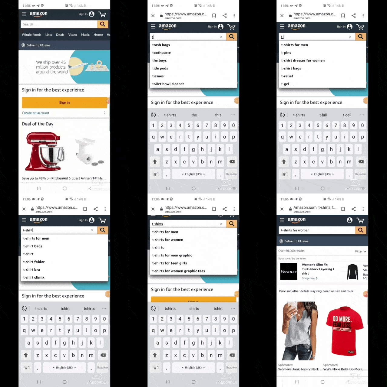
Moreover, there are plenty of various buttons, cool auto-fill and auto-submit options that help users control everything. And what about using photos for search and quick results? Cool, isn’t it? You just need to take a photo of an item or it’s barcode, insert it into the search bar and voila. You found that lovely sweater you were looking for so long.
All these actions can be completed with your mobile phone which is really convenient for people who are always in a hurry. What other strategies does Amazon marketplace use for attracting mobile customers? Let’s point out several tips that this giant always follows:
- Concentrate on titles of your goods.
- Make a short but catchy description.
- Use images with a wow-effect.
Seems fairly obvious but do not lose sight of the fact that these are the very first things mobile users see and remember. If there is an unclear title and description with a bad photo of the product, you will most certainly not buy anything. Now, it’s high time to think about that, so hurry up and start checking your titles, images, and descriptions.
Talking about the Amazon marketplace, we have a nice trick for you. Include EBC (Enhanced Brand Content) into your listings which is ideally adapted for mobile gadgets. All the customers see only the first 200 characters of the item description and to know some additional info, they need to click it. What’s the secret? Due to the EBC, you let customers examine all the info about your goods without clicking other pages. It means that the chance for users to make a purchase increases in several times. Take it into account.
Ways to Optimize Your eBay Listings for Mobile
Let’s move forward to the next eCommerce leader – eBay. We would not believe anybody who told us they had never taken part in auctions or bought anything on this marketplace. People who make purchases on eBay are characterized by using mobile phones most of all. It is because of the auctions which are held there. Customers would like to check the results on the go, and the most convenient way to do that is by using a smartphone.
So, even if you are not dealing with auctions, and sell your goods just as “Buy it now” you still need to think about mobile users. How is it possible to keep your store mobile-friendly? Except for the points above, we prepared some more that will help you make your store adaptive.
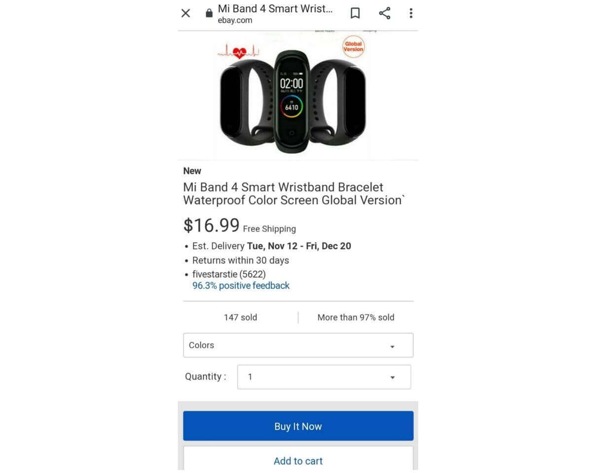
- Do not mix images and text descriptions. While learning the info about the item, all the photos will probably be on the bottom of it. There are almost no chances that people will scroll down to them. Add only important information to the description. As for images, just add them to the special photo gallery.
- Do not ignore the viewing item description summary option. It helps to work with and control descriptions of your goods on different gadgets.
- Do you include viewport meta tags? You definitely should. This option helps to scale all the descriptions of your goods depending on the gadgets they are going to be shown. You may always read some more additional information about such settings in eBay FAQ.
- Mobile adaptation on eBay, use special test. You can test the item description just inserting its ID in the mobile-friendly test.
Mobile-Friendly Strategy by Walmart
Walmart comes in third place in our ranking of mobile-friendly marketplaces. It is on the way to becoming a real eCommerce giant and its mCommerce is on an incredibly high level. So, why Walmart has already won the love of so many customers all over the world?
- Walmart’s separate mobile site shows the incredibly fast download time. Only 1.35 seconds. Sounds cool!
- The ability of clients to get to know about all the discounts and sales of the week, special offers for holidays and other events due to separate mobile version of their website.
- There are special mobile notifications which help people to save some money not only buying something online but in domestic stores also;
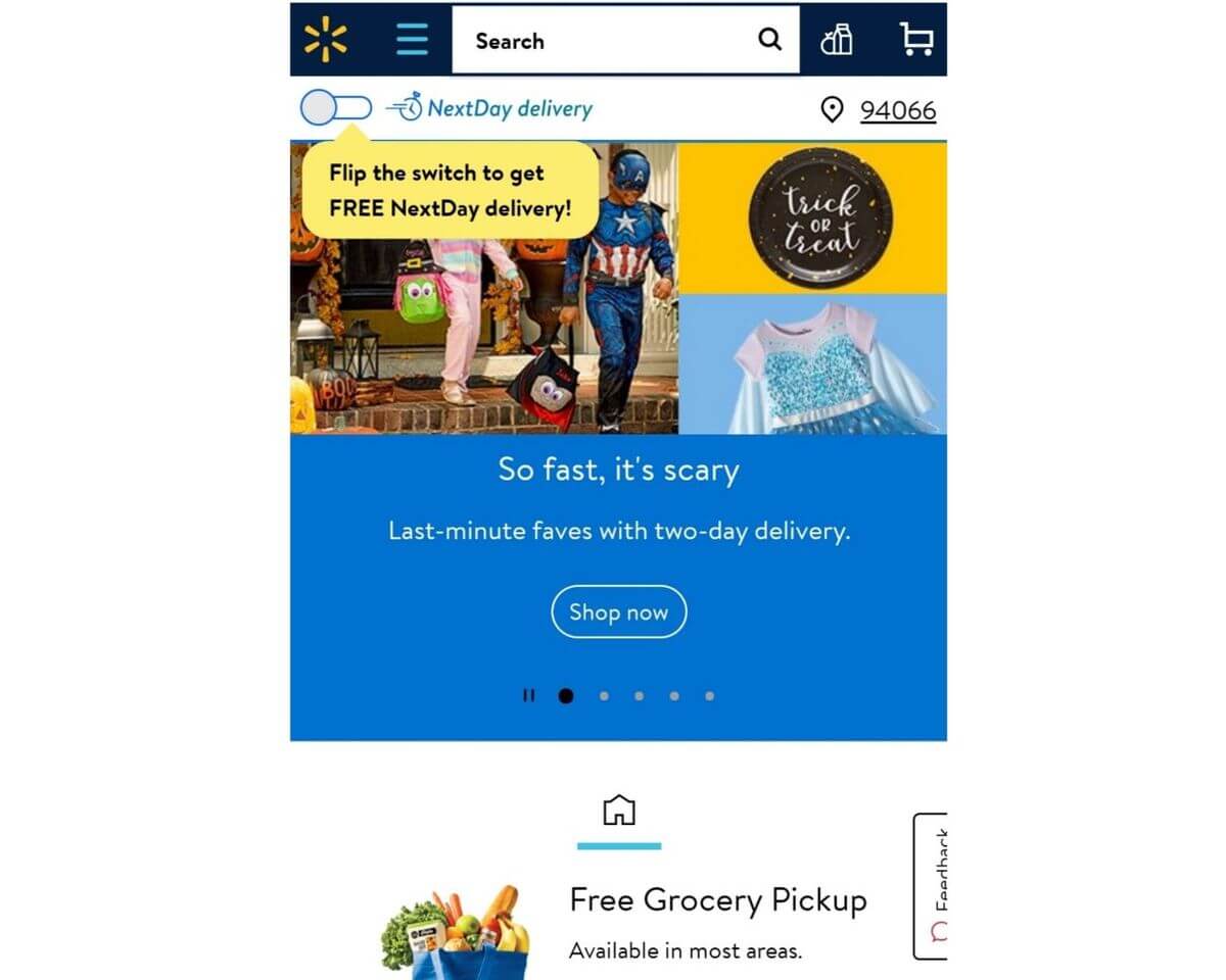
- The most unexpected result was associated with the display of information on the availability of goods. By removing the “Details” button from those products that are not in stock, marketers have significantly increased the conversion.
Being so popular among customers, providing them with low prices, cool sales, and convenient navigation not only in their local stores but online also, Walmart is becoming a real teacher’s pet. As a result, the new adaptive design and a separate mobile site provided a 20% increase in sales conversion rates on all devices. At the same time, the number of orders from mobile devices increased by 98%.
Ways of Mobile Optimization for Your eCommerce Website. Final Thoughts
After analyzing the successful plans of mobile adaptation by the most popular marketplaces, we made a list of the most important values you should pay attention to. All the strategies include such general points as:
- Convenience.
Sometimes searching for something on the Internet is time-consuming. That is why all the customers need to feel comfortable in navigation, site maps, payments, etc. They just want to choose the item they were looking for and buy it. Provide your clients with comfort and they will pay money for it.
- Access to all the functions.
Going to the mobile version of the web store, people want to find there the same functions and options they have on a laptop. Create the proper adaptation of everything you have on the website.
- Personalization.
Do not forget to take all the personalizations from your site to your apps and mobile versions to make your clients come back. Add some special offers, discounts, turn on notifications and create personalized recommendations to make your clients feel special. Help clients to be at home on your mobile version of your online store.
Do not miss the chance to optimize your store and make it mobile-friendly. By doing it, you get the ability not only to find new customers but return the old ones. MCommerce is a real trend in online business in 2019 and 2020 and in it’s going to rise even more in the nearest future.
Sellbery is a multichannel listing tool which automatically synchronizes product listings, order and inventory data between online stores on Shopify, Magento, Woocommerce and top marketplaces such as Ebay, Amazon, Google ads. etc.
Was this news helpful?




 Yes, great stuff!
 I’m not sure
 No, doesn’t relate


