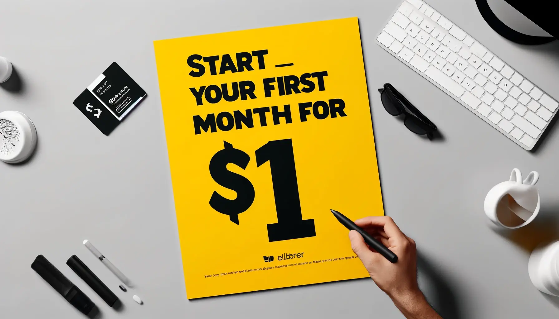
A compelling landing page focuses on a single purpose and includes catchy CTAs, well-written copy, customer feedback, and responsive design.
Shopify store owners should strive to create epic landing pages each and every time. These standalone pages are perfect for pushing visitors down the sales funnel and converting them into immediate or regular customers.
Depending on their budget, coding skills, and marketing goals, Shopify merchants have a few choices to pick from when designing a landing page. They can take an easy path and use a Shopify theme editor and countless builder apps or decide on a more complicated route.
The latter entails making a winning custom landing page from scratch. It’s a bit time-consuming and may require a team of professionals providing advanced Shopify store development services.
In this article, you’ll gain valuable insights into landing pages and their types, learn how to create a landing page with Shopify, and get some excellent tips on turning your landing page into a catalyst of high conversions.
Overview of a Shopify Landing Page
Unlike a homepage that contains plenty of information and encourages people to explore a website, landing pages zero in on a specific action: buying a product, submitting an email for a free sample, signing up for a newsletter, and more.
People typically come to landing pages through PPC (pay-per-click) advertising or email campaigns, social media posts, and organic search results. If the landing page offer doesn’t meet visitors’ click-through intent, they’ll leave feeling dissatisfied.
Even though the key goal of landing pages is to increase conversions, not all adhere to the same format. The layout and messaging may vary depending on your marketing goal. Let’s cover various landing page types and their uses.
Types of Landing Pages
Before delving into the technicalities of creating a Shopify landing page, let’s quickly brush up on the types of landing pages suitable for different marketing and sales objectives.
- A squeeze page collects users’ email addresses in exchange for some reward: a newsletter, coupon, e-book, or other free offer.
- A lead generation landing page resembles squeeze pages, with the only difference being that they gather more extensive data about visitors, such as their name, age, email address, company name, job title, etc.
- Click-through landing pages aim to entice prospects with a compelling copy and motivate them to hit the CTA button leading to a page where conversion takes place.
- Product landing pages give a complete overview of the product’s features and benefits. They have little to no links that may distract visitors’ attention from the offer.
- “Coming Soon” landing pages generate hype before launching a product or event. They typically include a countdown timer and a CTA asking for an email address, so users get notified when the product or service is out.
- A “Thank You” landing page doesn’t merely show appreciation to users for taking the desired action. They may contain special offers, and guide leads on taking further actions (exploring other web pages to increase user engagement).
- Sales landing pages, both short and long-form, are designed for one purpose, which is to convince customers to buy. They focus on showcasing all the benefits of a product/service and frequently use testimonials, “About Us,” and FAQ sections to address the issues potential customers may have.
How can brands ensure their landing pages strike home? Focusing merely on a flashy design isn’t an option. Businesses should take a strategic approach to creating Shopify landing pages. Check out the following recommendations for a more profound understanding.
9 Tips on Creating Enticing Landing Pages on Shopify
There are plenty of solutions for developing a high-converting landing page. Here’s a list of effective tips for engaging more potential customers and maximizing sales.
#1 Improve Landing Page Speed
Slow-loading landing pages can ruin the overall user experience and kill conversion rates. Web users expect near-instantaneous page responses. If it’s more than 3‒5 seconds, they will leave right away.
Keep landing pages short, three full scrolls maximum, to speed up rendering in the browser. Compress and resize images to prevent lagging load time. Enable CDN (Content Delivery Network) and browser caching, and don’t forget to remove unnecessary scripts and plugins that may eat into the landing page speed.
#2 Write a Compelling Copy
Create engaging storytelling around your product or service. Use the language of your customers. Dig into reviews and social media platforms to pick up the words and phrases your audience uses. Terms appealing to senses and emotions are also a great pick for engaging readers.
Try to be brief and to the point. Break copy into digestible pieces to facilitate text skimming. Don’t cram too much text into the page. Otherwise, visitors may diverge from taking the desired action.
#3 Emphasize Benefits
Avoid bragging about features. If you want to grab visitors’ attention, show them what advantages your product or service offers.
Avoid using general statements; give specific examples explaining to users how you can solve their problems. For instance, instead of writing ‘our team will clean up your flat in 2 hours’, say ‘Choose our cleaning team to have two extra hours for a hobby or rest.’
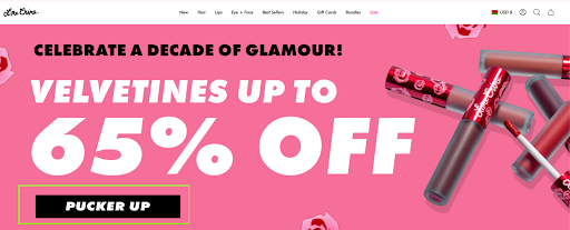
#4 Craft Eye-Catching CTAs
CTAs (calls to action) should evoke an instant reaction from visitors. Place them strategically, preferably above the fold, to draw viewers’ attention. Highlight your CTA with a different color so people don’t miss it.
Use specific action verbs that create a sense of value, urgency, or curiosity: ‘claim’, ‘discover’, ‘join’, ‘don’t miss out’, ‘act fast’, etc. Ensure the CTA is mobile-friendly and smartphone users can easily interact with it.
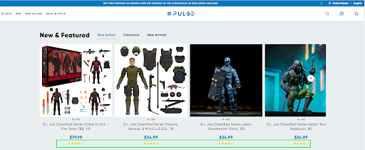
#5 Add Social Proof
Relevant customer reviews, star ratings, case studies, and testimonials do a great job of building trust with your visitors and persuading them to take action. It’s highly important that social proof comes from real people. If possible, include photos/videos of happy clients or their social media links to increase your brand’s credibility.
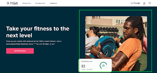
#6 Include Visuals
Visuals are pivotal elements in creating effective landing pages. Good pictures can tell a story, promote a product, and connect with visitors.
When choosing visuals for a landing page, make sure they’re authentic (stock images may disrupt trust in your brand), of high quality (second-rate illustrations have an adverse impact on the audience), and used in moderation (too many visuals distract visitors from the primary goal of the landing page).
#7 Remove Unnecessary Links
A good landing page concentrates on a single action, converting visitors into leads. Any additional links may draw potential customers away from the main goal. That’s why keeping navigation simple and minimizing all distractions like pop-ups should be a priority for an effective landing page.
#8 Perform A/B Testing
A/B testing is an excellent way to uncover problem areas in a Shopify landing page. This practice involves creating several templates and showing them to different groups of people simultaneously. Analyzing test results gives a better understanding of user behavior and helps remove friction points hampering conversions.
#9 Go Fully Responsive
With the number of mobile users comprising around 50% of web traffic, optimizing your landing page for mobile devices is non-negotiable. Choose a responsive design to provide visitors with a flawless user experience no matter what device they view from.
Stick to simple, uncluttered content to help potential customers quickly scan and understand it. Besides, opt for large and distinct fonts to streamline the reading process. Use a single-column layout, free from distractions, to keep your users focused down the page toward conversion.
Practical Ways to Create a Landing Page on Shopify
There are several tried-and-tested methods to make landing pages for a Shopify store. Let’s look into each of them.
Method #1: Utilize the Shopify Theme Editor
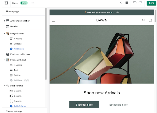
With the Shopify theme editor and Online Store 2.0 themes, you can start creating landing pages on your own. It’s the most basic and effortless approach. Simplicity wins over functionality in this case because the process involves using templates.
After choosing one of the many pre-built templates, you can make certain changes and adjust content to get the desired landing page. This method works well for small stores or those on a limited budget. If you’re looking for more sophisticated solutions, consider the alternatives below.
Method #2: Use Shopify Liquid and JSON
Liquid and JSON are Shopify’s theme-templating languages that enable online store developers to build an effective landing page from scratch with a high level of customization.
Of course, you must know how to code in Liquid and JSON or hire a developer if resources permit. Creating pages this way is never a speedy process. Therefore, it’s necessary to allocate some extra time in the work schedule for it.
Method #3: Take Advantage of Builder Apps
In case you don’t have a developer on hand but still want to create a stunning custom landing page, Shopify builder apps are an excellent solution for your online store. They are packed with loads of advanced features like heat mapping and mobile-responsive drag-and-drop templates.
Besides, these apps easily integrate with your Shopify store, including email marketing automation services, CRO tools, and analytics. Let’s go over three Shopify page builder apps and their prominent features.
- PageFly
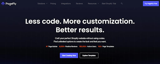
PageFly is trusted by popular eCommerce brands, such as Wrangler, Munthe, Volant, and Nitori. This app has all the tools to craft landing pages for any marketing purpose, including a rich library of pre-made templates. PageFly is renowned for its amazing support staff, which is ready to tackle issues in a matter of literally ten minutes, according to users’ reviews.
- Shogun
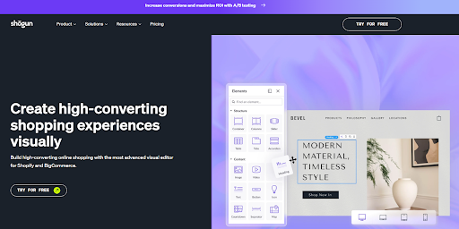
Shogun enables Shopify store teams without coding knowledge to create rich and dynamic landing pages. The app features a vast collection of drag-and-drop templates. Due to its Preview function, you can check the current layout on various devices. Thanks to its AI Designer, generating store content in the Shogun app takes a few seconds.
- GemPages
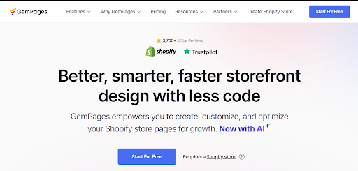
GemPages is a robust tool for designing compelling landing pages. It offers many pre-built mobile-friendly templates covering most scenarios and use cases. The app incorporates numerous conversion-focused elements, such as pop-ups, inventory trackers, and countdown timers.
Its AI-powered Image-to-Layout feature allows users to generate customizable layouts from references. Add a screenshot or a page link of the layout you like, click the “Generate” button, and start editing. GemPages syncs with Facebook Pixel and Google Shopping.
Shopify Landing Page Examples to Follow
Now that we’ve covered some useful tips and viable options for creating a landing page with Shopify, it’s time to get inspired by real-world models from the top brands.
- Shopify
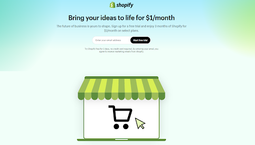
Shopify’s free trial landing page is the one to aspire to. It’s easy on the eye and not cluttered with text. The page welcomes visitors with an enticing offer and a precise “Start free trial” call-to-action button. The CTA appears in the hero area and then again closer to the bottom of the page.
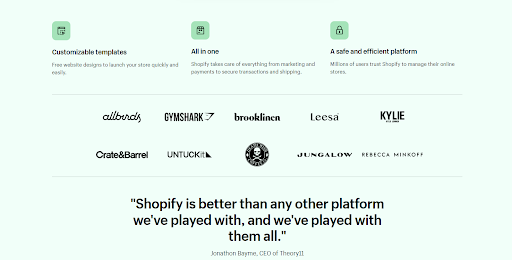
One scroll down, and we see Shopify enumerating its unique selling points as well as its top clients. A shrewdly incorporated testimonial attests to why the platform should be deemed the best.
The landing page closes with a CTA and an FAQ section to address common objections and put customer concerns at ease.
- Soko Glam
Soko Glam’s landing page is remarkable for its neat layout, subtle color palette, and prominent call-to-action button. The page promotes a skin concierge service and explains in detail how users can get expert advice on skincare routines.
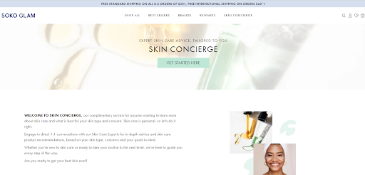
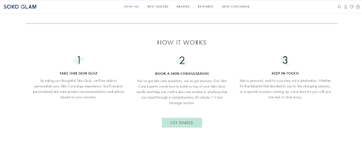
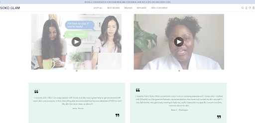
Soko Glam accompanies the text content with video tutorials on how to get started and shares testimonials from real customers. This definitely adds more credibility to the brand.
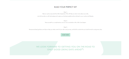
As viewers scroll down, they see one more CTA with a brief revision of basic steps and read an inspirational message that motivates them to get on the road to good skin. The cherry on top – Soko Glam adds customer reviews at the end of the page to encourage more clicks.
- Flow
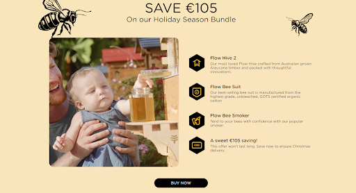
Flow’s product landing page promotes the holiday season bundle comprising everything a beekeeper needs to harvest honey. The headline creates a sense of urgency and directs customers to make a purchase with a clear call to action.
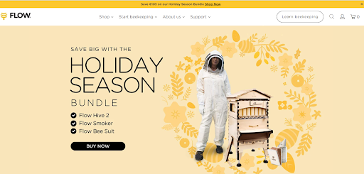
Every scroll showcases an informative section that gives a comprehensive overview of the beekeeping set. Flow leverages lively visuals of products in daily use, emphasizing the strong link between customers and its natural goods.
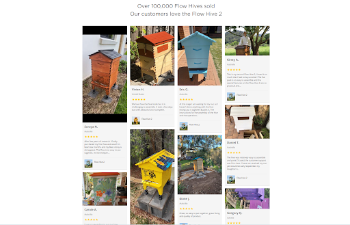
Countless 5-star reviews of happy customers with real-life photos persuade visitors that the product is worth buying.
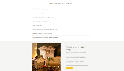
Closer to the bottom, Flow highlights the FAQ part to provide prospects with clear and concise information on common issues. The landing page logically finishes with a “Shop now” link to keep viewers focused on the primary goal.
Wrapping Up
Draw inspiration from these Shopify landing page examples and get creative with your own designs. Leverage Shopify apps or play with code to build customized templates. If you’re short on time and money, choose the theme editor to streamline the process.
Crafting compelling landing pages will be quite easy, provided that you take into account the following guidelines: opt for a fully responsive design, simplify navigation, craft engaging content and eye-catching CTAs, include customer reviews, and ensure fast load times.
Was this news helpful?


 Yes, great stuff!
 I’m not sure
 No, doesn’t relate