The main thing that most sellers focus on is sales. Undoubtedly, the level of sales is paramount to the company’s success and you need to do everything in your power to raise it.
The main thing that most sellers focus on is sales. Undoubtedly, the level of sales is paramount to the company’s success and you need to do everything in your power to raise it. However, while making necessary tweaks and changes in advertising and marketing campaigns, some sellers forget that the product page itself can be a huge influence on buyers’ decision process. ?
If you make things right, product pages will not only be the customers’ source of information but they can become that last thing that will tip the scale ? in your favor and convert passers-by into buyers. That is why we have collected the top 10 best tips and tricks for boosting product page conversions.
Images and Video
From the point of view of customers, one of the biggest disadvantages of online shopping is that before buying the product they cannot check it. The next best thing that a seller can offer in this case is great product images. ?
Your product pages only have a couple of seconds to make the first impression. So, every element of the page should be well thought-out to catch the customer’s eye and make sure he or she follows through to the checkout page. And the feature image of a product does just that.
You need to upload as many photos as needed to show off the product in the best light. And for items with many details, it is better to create full galleries of photos to show them all. Having a good set of high-resolution product images is especially important for mobile sales.
Plus, try your best to include images that shed light on the user experience. Like in the example below, Baron Fig provides images that help understand what it feels and looks like using their products in real life.
You can also use GIFs and video to enhance the shopping experience. ?️ Videos are a great way of telling a story about your products and actually showing how it is used in different life scenarios. Make sure to make the videos short and descriptive; integrating video marketing trends such as AI-assisted videos, shoppable videos, and user-generated content can significantly enhance engagement and conversion rates on your product pages.In addition to showcasing the products on your website, you can also use videos as promotional materials on other websites or marketplaces, so investing in professional videography can be worthwhile.
Incorporating engaging media like AI-powered enterprise videos can capture consumer interest effectively. These advanced video solutions tailor captivating narratives based on customer data, blending brand storytelling seamlessly into your product pages. Employing such personalized and adaptive media helps maximize engagement and ultimately boosts conversion rates by directly addressing individual customer needs.
Another great way to show off your products is 360° imagery. For example, companies like Hoot and Imajize offer services of creating 360-degree product photography that can be a great addition for creating a real-life context or show off complex products like collapsible strollers in their full glory.
Including images and videos on product pages is crucial for enhancing the shopping experience and boosting conversions. Leveraging user-generated content (UGC) can significantly amplify this effect by showcasing authentic product experiences from real customers. By integrating UGC, such as customer photos and video reviews, into your product pages, you foster trust and credibility while providing potential buyers with relatable and tangible examples of how products are used and loved in real life. This authentic visual content not only enriches product showcases but also encourages community engagement, as satisfied customers are likely to share their own experiences and contribute further.
Utilize proven eCommerce psychology practices
The sense of scarcity
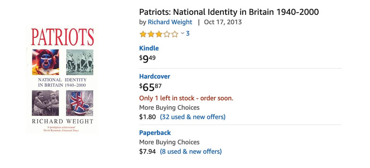
⚠️ This is the tactics of making the customer feel like the product that you sell is very popular and is running out of stock which creates additional incentives for purchasing right away. It is quite often utilized by the most popular marketplace in the world — Amazon.
The sense of urgency
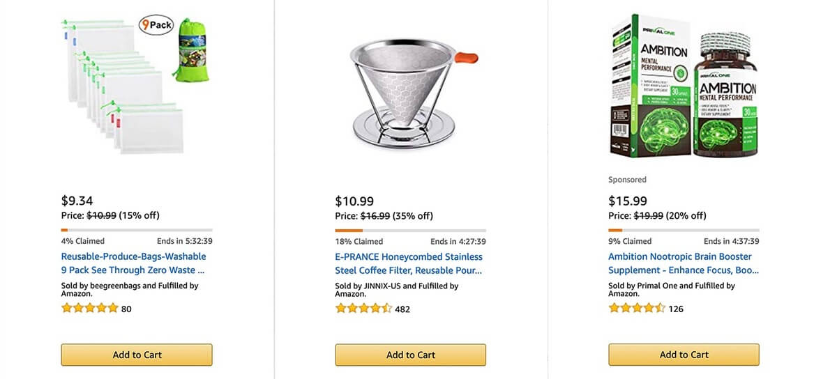
?️ This principle is often presented in various online stores in the form of timer counting down. On these Amazon screenshots you can see an example of mixing up the two principles. The timer counts down how many hours you have left to purchase and the claimed % of products shows that there are not many of the items left in stock, making customers to make the decision and buy now.
Add reviews
You can take all sorts of advertising and marketing efforts to drive new customers to your website but it does not guarantee any sales. ? For shoppers of online stores, it is only natural to want to hear the first-hand experience of somebody who already tried the product that they are yet to even hold in their hands. Some studies suggest that up to 90% of people tend to trust online reviews and read them before purchasing. So, bring the reviews to them right on the product page. Reviews build trust and help buyers make the decision based on information that they get from real people ?♀️ and not from some online marketer.
Of course, it might be a little scary to add reviews right next to a product, since not every review is positive. But if you do not have a place for reviews on the website you leave your customers with the only choice — go and leave the review somewhere else. ? Then you have a bad review online forever, seen by thousands of people and you cannot always defend your product on third-party websites. It is much easier to manage the reviews on your website, contact the unsatisfied customers ? directly to solve any issues and incentivize customers by email to leave good reviews.
The absolute majority of online buyers will not even consider purchasing a product that does not have reviews. But they are just as likely to go to another website that sells the same product to read reviews there and just purchase it there. And you lose that sale.
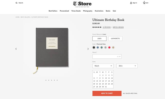
You should make the reviews section and ? “write a review” button clearly visible on the page, just like the NYTimes online store did on their website.
Social proof
Just like reviews, social proof’s main goal is to improve customers’ trust and build up your company’s reputation. Social proof examples include shares, likes, wishlists. All or some of those can be easily added to your website with third-party plugins and widgets like ShareThis or Sumo.
In addition to reviews, try adding images or posts from your customers’ Instagram or Facebook to your product pages. It will help to create a feeling that your products have a certain social following and might persuade some people to join the already happy buyers. ⭐ Needless to say that if the said following includes modern influencers or celebrities, the customers will be even more inclined to purchase.
Trust badges and statements
With new stories of bank details theft emerging almost daily, it has become very important for online shoppers to get some piece of mind. Adding badges like “secured by” or “safety guarantee” ? to your product pages gives buyers a lot more confidence.

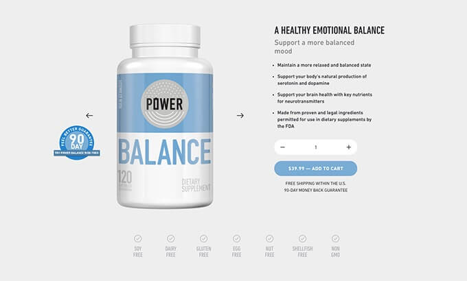
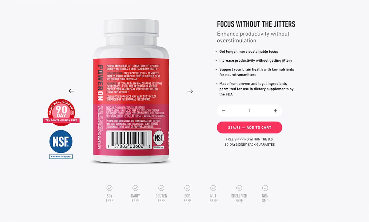
Whenever applicable you should also add products and services based badges to the pages. For example, you can highlight some features like “gluten-free” or some services that you can provide, like “90-day returns”. If you have some certifications ?️ from authoritative companies, make it visible on the page, as Modus Nutrition does on its website in the example below.
Optimize an eCommerce Product Page
The general rule is “the simpler the better”. No customer wants to go through lengthy paragraphs and overload of different text formats just to get one piece of information important to them.
You need to unclutter the pages to make the shopping experience swifter. Do not go into detailed descriptions in plain text, instead, describe the different features in bullet points. Add enough spacing between different blocks of information to visually separate them.
Also, it is better to make the product description tell a story of how your product can helps buyers in their everyday life. For example, Modus Nutrition not only tells a story in the bullet points on the right but also highlights the most important product details at the bottom of the page that catches customers’ attention right away and helps decrease objections.
Anticipate questions
The highlighted product details at the bottom of the Modus Nutrition’s page not only make it convenient for customers to get important information but also anticipate any questions that customers might have.
Another good way to provide all necessary info from the get-go is by adding FAQs to product pages. This helps to lower the initial level of objections and keeps the customer on the website.
But sometimes the sheer amount of possible questions is too great to list them all on the page in plain text. In this case, you can turn to ?️?️ live chats or chatbots. Surveys suggest that it is a great way of providing a higher satisfaction level. Chats also strengthen the level of customer trust.
CTA buttons
There are two types of CTA buttons: primary and secondary. Primary ones call on customers to go through with the purchase, like “Add to cart” and “Buy now”. And secondary buttons are the ones that provide customers with an alternative way around your website while keeping them from leaving it.
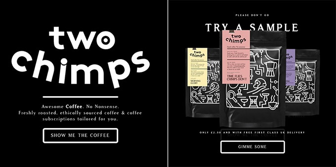
Two Chimps, for example, uses clever CTAs on their product pages and popups that catch customers’ ⚓ attention and make them want to explore the website more.
Another example of a CTA button is the “back in stock” reminder. Even when the customer stumbles on a page of a product that is currently out of stock, not all is lost. You can still keep the customer by allowing them to leave their contact information and later sending them the reminder.
Optimize your whole website
What springs to mind when you think about online shopping is convenience. People shop online because it is easy to just click a few buttons and get the product to their doors. So naturally, your online store has to provide a simple and swift service.
Product pages speed is important. You can use the free Google PageSpeed Insights tool to check how well your website is performing and, if needed, make some important changes.
Another point is website optimization for mobile devices. ? According to Statista’s 2017 research data, 82% of all online shoppers in the US used mobile devices to purchase products online and 35% of them do not even use PC at all when shopping. If your product pages are not optimized for mobile, you will simply lose this share of customers.
To check if your website is well optimized for mobile devices you can use Mobile-Friendly Test.
Make website navigation convenient
Remember that the customer can end up on one of your product pages without any knowledge about your website. In this case, it is important to make sure that they can easily navigate through it. If your online store has a lot of categories and products use breadcrumbs to help customers explore it. Breadcrumbs are a sort of map for buyers.
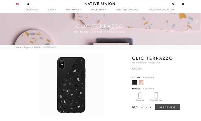
For example, the Native Union store’s product pages have the top bar that a customer can use to easily go from one category to another. And there is the hierarchical breadcrumbs ?️ path that allows going one step up to all products in the chosen category.
Upsell and cross-sell
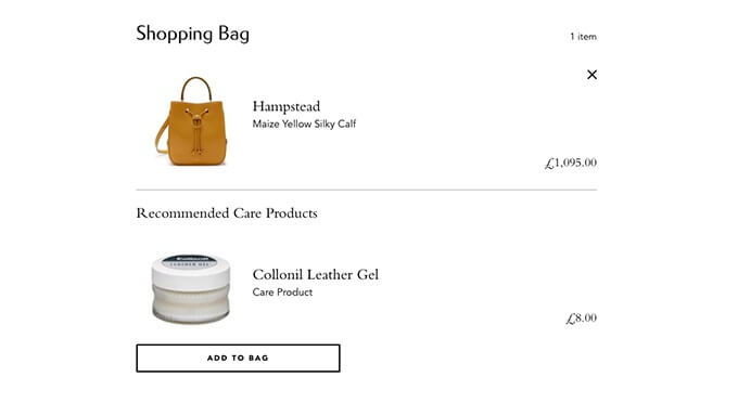
This is the oldest trick in the book but it still works. When a customer finally goes on and adds some product to their cart, show them a popup with related products. It is important to remember not to overload the page with related items ? that the customer should be interested in, in your opinion. Instead, try to actually add to the customers’ shopping experience by offering something that complements the item that the customer already have their mind set on.
For example, like the Mulberry shop does by recommending additional products right in their cart.
As you can see, there are many proven best practices for boosting the product page ? conversion rate. If you follow these tips, chances are that you will see a rise in sales and orders in your online store.
Was this news helpful?



 Yes, great stuff!
 I’m not sure
 No, doesn’t relate